


YELLOWS
- Reduced saturation and shifted slightly toward neutral gold.
- Keeps whites, linens, and florals crisp instead of brassy.
- Enhances sunlight tones without making greens appear neon or yellow.
Effect: Gives a golden-hour warmth that still feels refined, not “Instagram-filter” warm.

GREENS
- Softened and slightly desaturated to avoid harsh or neon tones.
- Shifted gently towards warmer olive hues instead of cool aqua greens.
- Creates that luxury editorial lawn look — elegant, not overly vibrant.
- Keeps foliage looking natural and cinematic (perfect for garden weddings).
🪄 Effect: Greens feel calm and timeless — the background supports the couple rather than stealing attention.

BLUES
- Muted and softened to remove harsh cyan tones.
- Sky and water tones lean slightly toward a pastel grey-blue, adding sophistication.
- In shadows, blues are cooled just enough to balance warmth from skin tones without going muddy.
Effect: Clean, airy skies and classy dusk tones — the blue never competes with the subject, it enhances contrast subtly.

REDS & ORANGES (skin tones)
- The heart of the preset — carefully refined for luminous, natural skin.
- Reds are softened to reduce blotchiness or over-saturation.
- Oranges are slightly lifted and neutralized (less orange, more beige-peach).
- Keeps warmth where it belongs — in the light, not in the skin.
Effect: Skin looks buttery, glowy, and editorial — not orange or flat.
BLACKS & SHADOWS
- Soft, film-like contrast curve.
- Preserves detail while keeping depth — no crushed blacks.
- Adds that creamy shadow tone typical of high-end editorials.
Effect: Deep tones stay rich and smooth, helping subjects pop against any background.

WHITES & HIGHLIGHTS
- Pure and neutral — whites stay white.
- Slight glow added to highlights for a clean, luminous finish.
- Avoids blown-out detail while still feeling bright and airy.
Effect: A signature “clean light” look — dresses, skies, and glass details shine without losing texture.

PURPLES & MAGENTAS
- Calmed and neutralized to blend naturally with skin and florals.
- Prevents magenta casts in shadows and skin tones.
Effect: Keeps the overall palette balanced and editorial, with no unwanted color tint in whites or neutrals.

💘 WHO'S THIS PRESET FOR
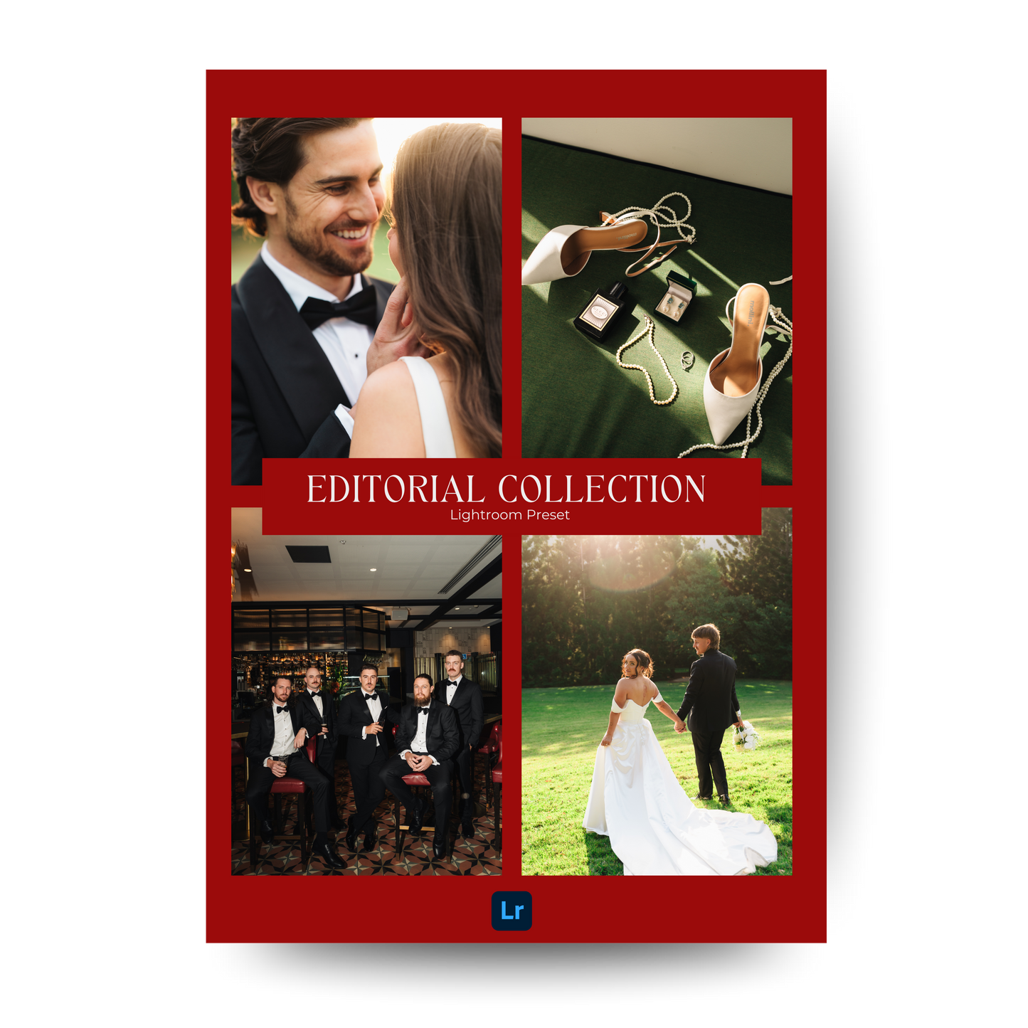
The Editorial Collection Preset is made for photographers who crave that clean, modern, and high-end look.
It’s for you if you love:
- True-to-life colors that still feel cinematic and glowy
- Timeless skin tones that flatter every lighting situation
- Luxury wedding aesthetics — think glassware, white florals, soft sunlight, and designer fabrics
- A cohesive look across digital and film shots (it pairs beautifully with Portra and Fuji tones)
- Editing that’s quick, consistent, and versatile — from golden hour portraits to indoor receptions and flash moments